Advertising screams, ‘We want color photos!’ and galleries yell back, ‘Only black & white matters.’ That was the past. Yes, it’s certain that color images dominate in print and web advertising and that classic photography found in galleries is more closely associated with black and white images but both genres can be found in all places.


The use of B&W photography in advertising seems to ebb and flow. There was a big resurgent of its use in the 1990s and lately I’ve been hearing that requests for images in black and white are increasing again.
Of course in the digital world you can have it both ways. Even if you shoot in B&W mode, the color information is retained. Purists argue that digital B&W can’t compete with film and prints from negatives. This is an argument that will also soon fade away. However, the best way to print the classics is from the original negs. Of course, they can be scanned and I hope many are since that is the best means of preservation and record of the images (at least for now).
In our new place I found that a lot of paintings and drawings went under the bed and behind the couch, while I hung B&W photos almost exclusively in the main rooms. I am fortunate to have some great prints by some of the masters: Running Deer by Caponigro, a wonderful Cartier-Bresson with the added benefit of being signed to me, Karsh’s Georgia O'Keefe etc.
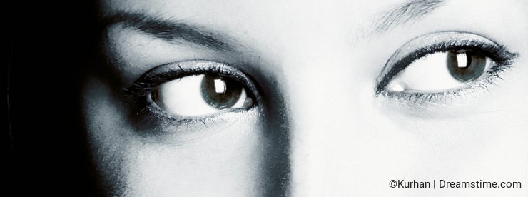
There is nothing like the glorious nuances of grey, black and white in these images to add elegance to a room, to an advertisement or a design. It’s a rare color image that works as wall décor compared to its companion in B&W. Although I have seen some stunning images of close-ups of flowers blown up 4'x5' that surely add drama to the right decor. Some of the most exciting images in the fine art world in the past twenty years have been color: Cindy Sherman's work for example
Sometimes a mood or emotion is more easily conveyed by use of B&W rather than color images. This is especially true if the concept is one of sophistication or one of the darker emotions. To give an illusion of vintage or retro, sepia tone or B&W adds to the impression of age. Certainly truly vintage photos are always in B&Was color didn’t come into popular use until not that many decades ago


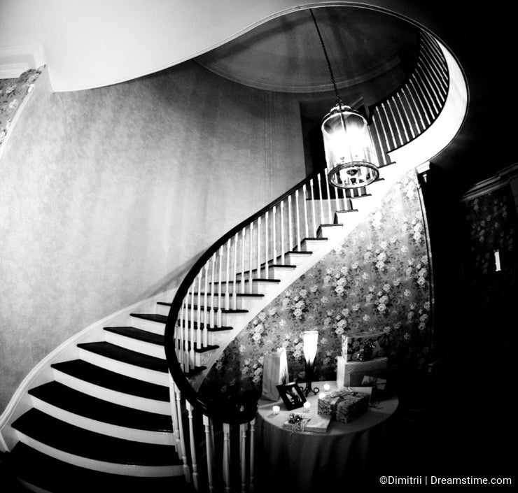
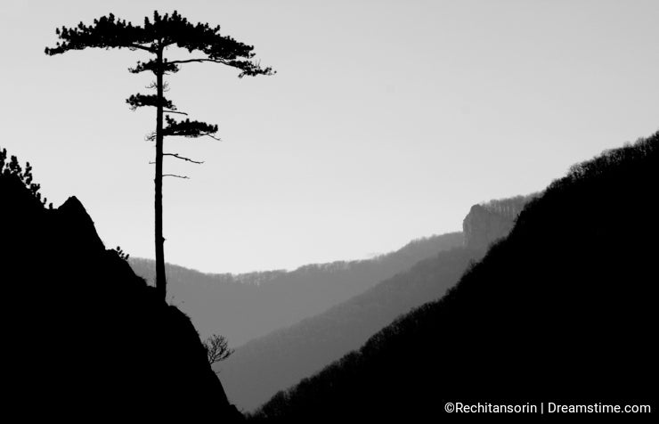
Simple images work best in stark monochromatic tones. And certainly most very colorful birds or scenes shouldn’t be presented in B&W as they could lose the impact of the very nature of what they are. Landscapes can be turned from dull to stark and beautiful simply by converting them to B&W. I've never been a fan of Ansel Adams' work but there is no denying that his Moonrise over Hernandez converted a sleepy town into a magnificent scene. Architectural structures and textures in nature also come into relief when presented in B&W. Experiment with your images and find those that should be converted especially if they will work as brochure covers or wall decor.
Further resources and tips:
Short take from video on Cartier-Bresson
Your comment must be written in English.
We value all opinions and we will not censor or delete comments unless they come from fake accounts or contain spam, threats, false facts or vulgarity.
Bobwyo
Running Deer on your livingroom wall? Argh! I'm jealous. I only have a Caponigro poster. When I visited him, he didn't even have a print of that beauty in his house.
More seriously, perhaps the reason B&W is seen as more artistic goes back to one of your blogs that suggested a great stock foto is incomplete. B&W has everything but the color. We get to work that out for ourselves, so may participate in the artistic experiment more as we view monochrome images. Advertising needs immediate impact to bring a viewer in, so color may take the guesswork out of our wondering why that foto is there.
Plunin
It's a great topic, thank you. However the examples say that bw photos are not successful as stock images, are they?
It's indeed a rhetorical question. I would say those photos are not stock despite the color, rather they are a piece of art. I'm afraid, if Bresson would have tried to sell some of his works here, he wouldn't have earned a cent :)
So 'where is a border between the Great Photography and Successful Photography... May the first be a part of the second?..'
Old story, but if you once share your thoughts and experience on this question, I think, we all will be grateful.
Ellenboughn
Today would have been Henri Cartier-Bresson's 99th birthday. Slate article about same:***.com
Ellenboughn
This entire post is very nicely summed up on this recently posted YouTube video.***.com
Maigi
Great you choose that topic! I don't know why, but it seems to me that B&W photos are usually more artistic (I'm not sure, is it a right word, I meant like fine art) than multicolor stock shots. And I feel that it requires better technical skills. Some day I'll try it too.
Thanks for the great links! Again. :)